works
Travelogue
[Designer] Mares Rayeshtyan, David Jon Walker
[Type] Type Design
[Studio] WeType
[Year] 2025
[Status] Published
this typeface is a collaboration with David Jon Walker, developed for WeType. david had the bones already. a masthead pulled from an old green book cover, one weight, about 70 glyphs deep, basic latin plus punctuation, numerals, a handful of alternates already sketched in for the A, Q, D. it still looked like it could've been hand painted, brush marks and all, and that's what got me interested in the first place. whoever made it, it lived on a publication meant to help people travel safely through a country that wasn't safe for them. that context changed how i touched every letter after.
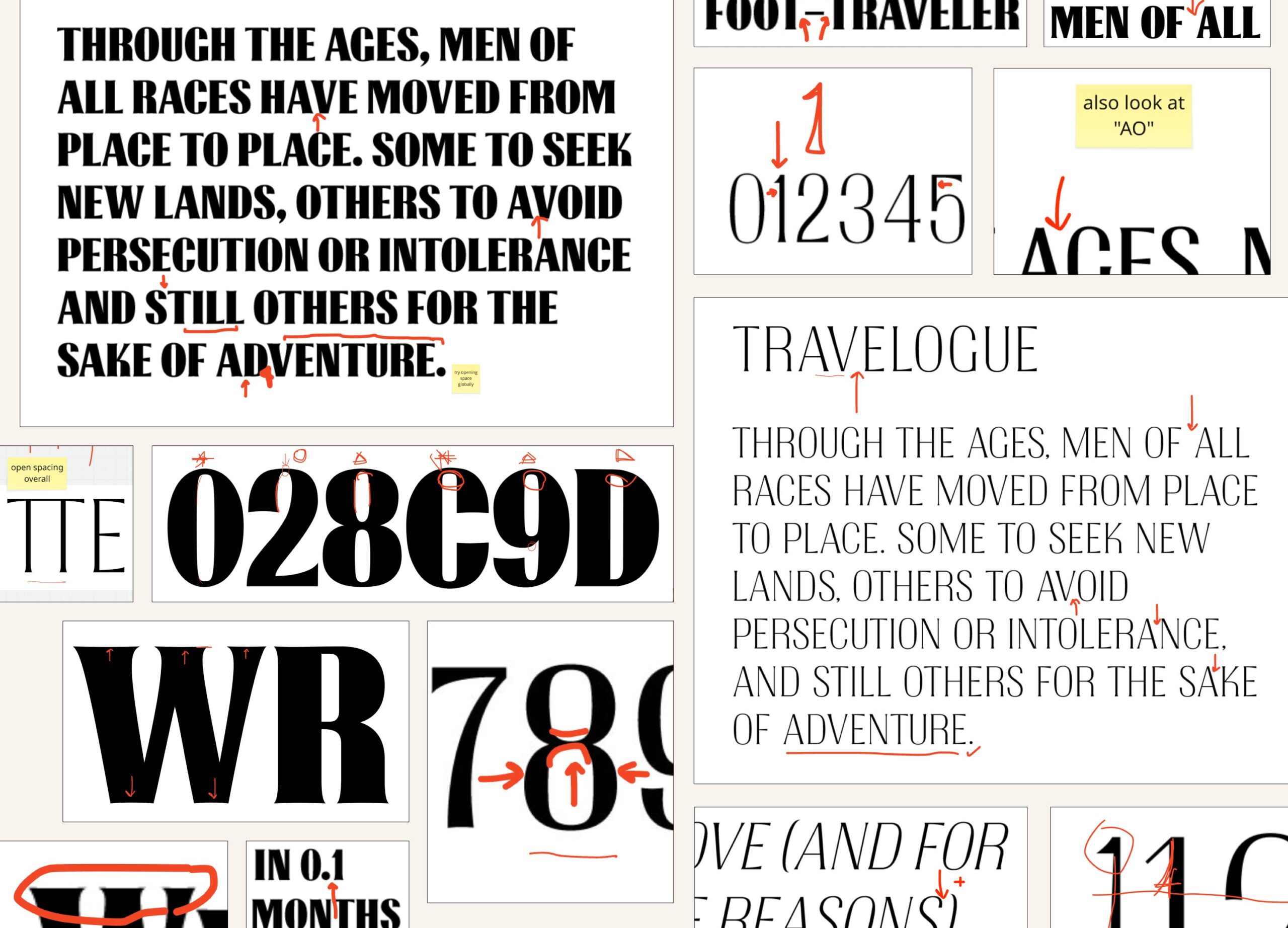
my role was to take those 70 glyphs and build the rest of the family around them, learning the logic of the hand before adding anything new. one decision came early: no lowercase. the letterforms were drawn too bold, too upright, too proud to shrink down and still read clean at small sizes, so small capitals became the lowercase instead, functionally standing in for it across the whole family. once you understand how the “A” holds its weight, or where the alternate “Q” tail wants to swing, the rest of the letters mostly tell you what they want to be, you’re just listening at that point, not inventing.
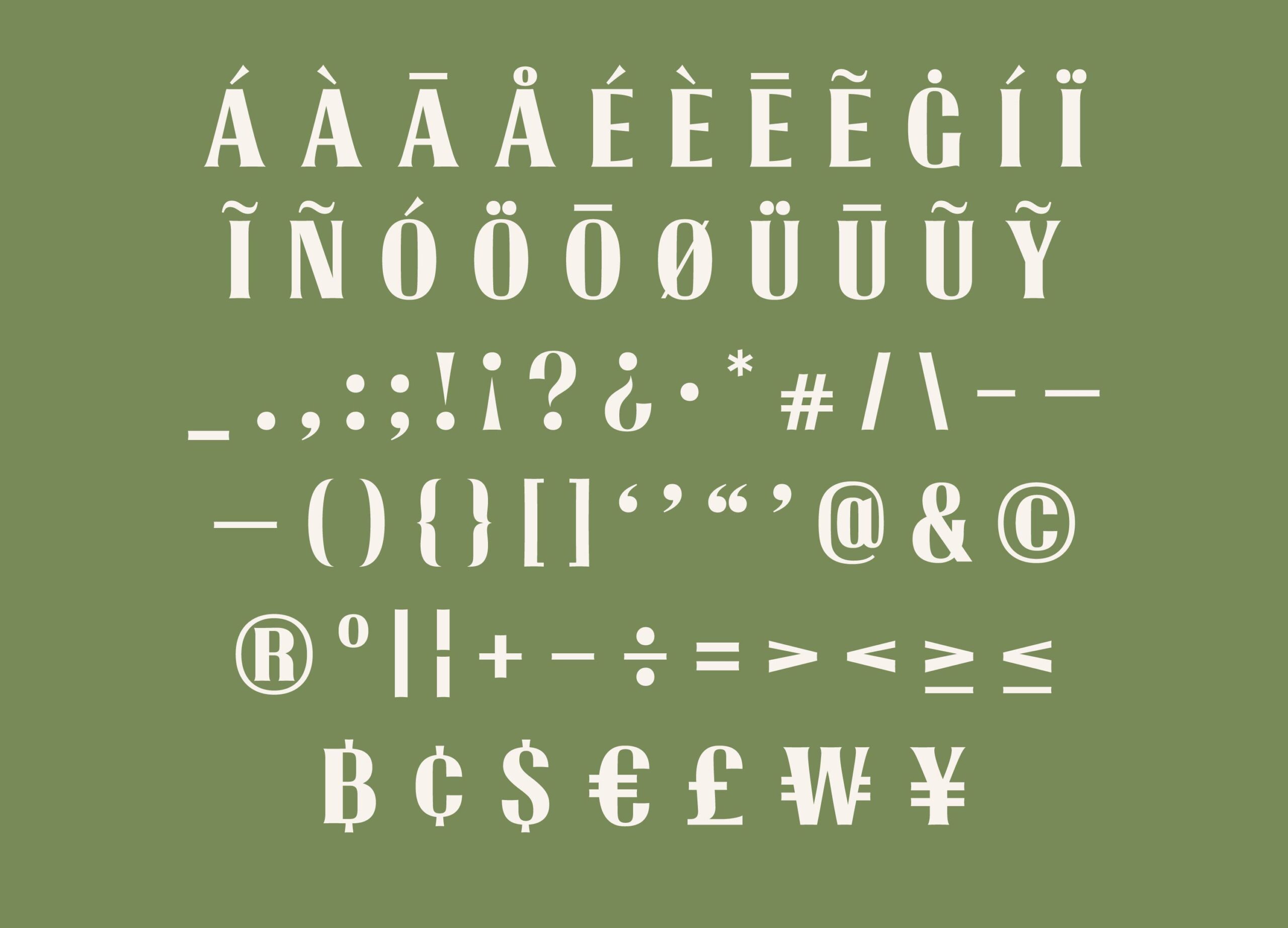
i built out to 184 characters total, filling in diacritics, extended punctuation, more symbols, then developed six masters, thin to black, plus their italics, and interpolated between them to land on 18 styles, with a full variable axis from 100 to 900 weight and 0 to 12 degrees of italic. side bearing and kerning i did by hand across every pairing, because a typeface with this much personality breaks fast if the spacing doesn’t hold it together. one bad gap and the whole hand-drawn feeling collapses into something mechanical.
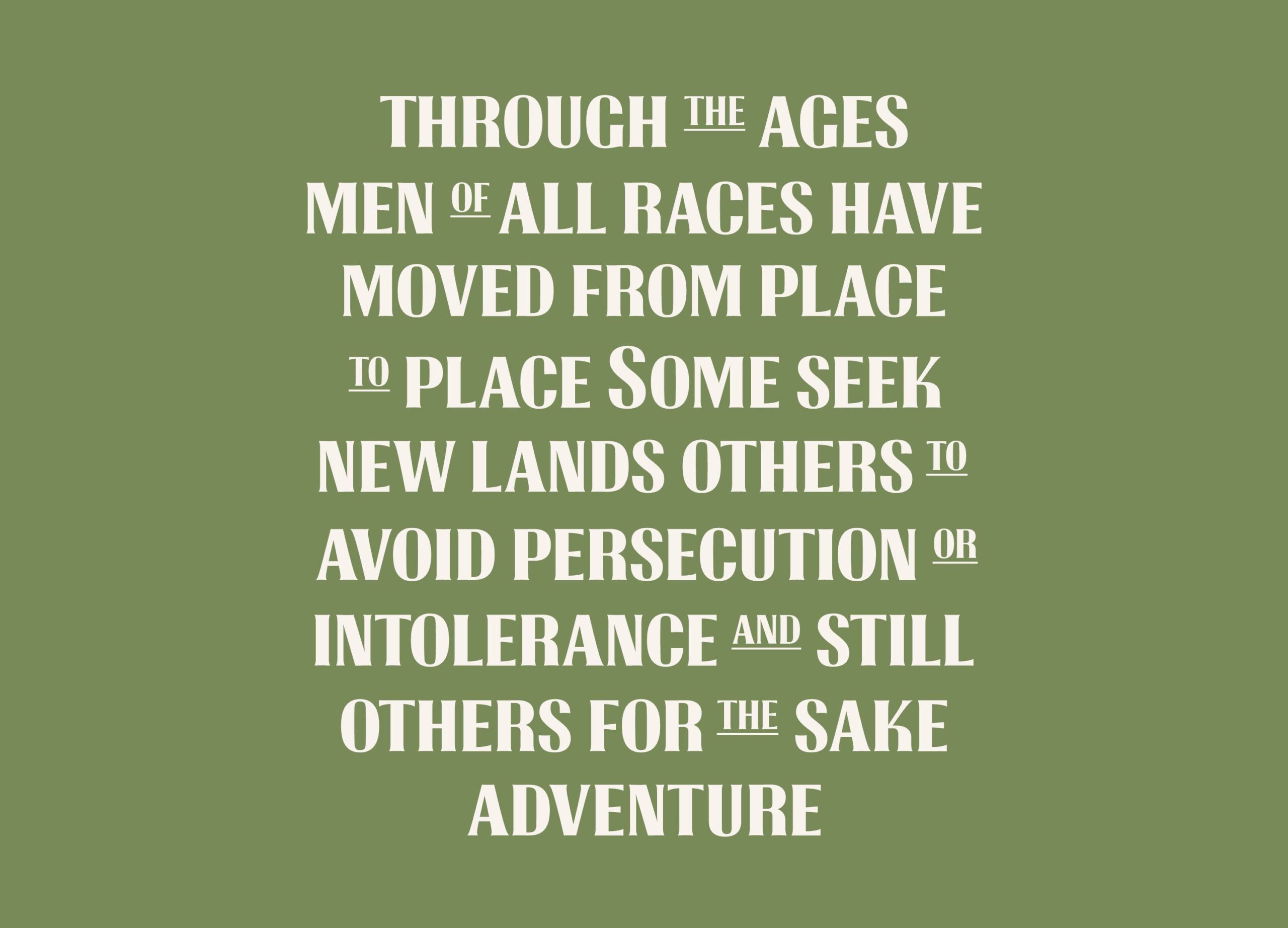
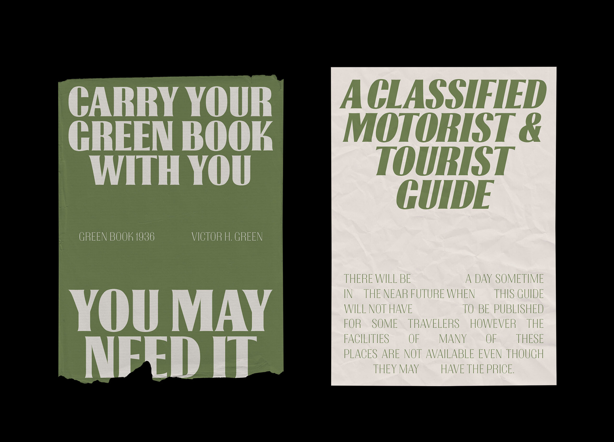
that almost happened. somewhere in the middle of extending the family i tried cleaning the form up, smoothing the inconsistencies so it would be easier to build more weights from. it worked, technically. it also stopped feeling like anything. it turned into something you’d expect from an industrial machine, not a hand holding a brush under pressure. i put the imperfections back, the small hesitations in the curves, and it started breathing again. i learned something from that mistake: some inconsistency isn’t a flaw waiting to be fixed, it’s the fingerprint. take it away and you’re not simplifying the design, you’re erasing the person who made it.